It’s been a while since I’ve used my Yealink MP56 Teams certified Desk Phone. I only bought it for testing purposes anyway… But today I noticed that the call control UI has been completely revamped.
I’m running Firmware Version 1449/1.0.94.2022090705/0907. (And yes, I used the awesome PowerToys Text Extractor (Win + Shift + T) to copy the text from the screenshot below.)

An incoming call now looks like this. If I remember correctly, the buttons used to be much smaller and located next to each other at the bottom of the screen.

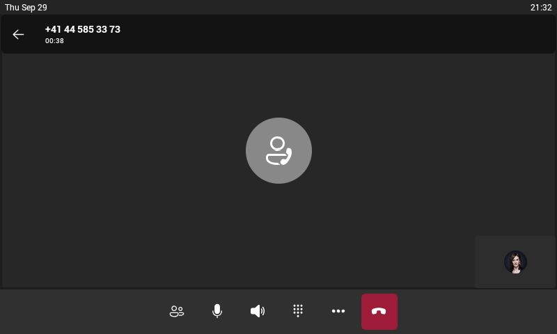
The in-call controls also feature larger, centered buttons now.

The transfer button has been moved to the main screen, which means that you’ll need one tap less to initiate a transfer now.

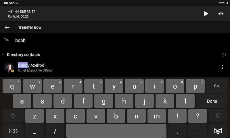
The menu for the actual transfer / search looks the same in both the new and the old UI.
You can still bring back the old view by tapping …More. and then Change view.

This will transition into the old UI where everything is located at the bottom of the screen.
Funny enough, there’s no option to switch back to the new look once you’ve changed the view.

The only way to get back to the new view is if you tap the ← arrow and then Tap to return to call.

This will bring back the revamped UI for the active call. I suspect that the old UI will be removed entirely sooner or later. I don’t see any reason why one would need or want two different calling UIs. I also don’t think that Microsoft wants to maintain two different UIs. Especially if the new one features a lot of improvements and welcome changes.
Oh, and thanks to MVP James Cussen for the awesome Teams Phone Screen Capture Tool.